WhatsApp beta tests new bottom navigation bar on Android

0
13
WhatsApp beta tests new bottom navigation bar on Android
1680819461 whatsapp beta tests new bottom navigation bar on android.jpeg

WhatsApp has started testing a new bottom navigation bar on Android. The novelty was added version 2.23.8.4 beta of the messenger for the Google operating system and promises to simplify the functionality of the application for users.

According to the WABetaInfo website, the novelty is the result of user requests for a more modern and intuitive way of navigating the application, facilitating and speeding up access to important features such as chats, calls, communities and status.


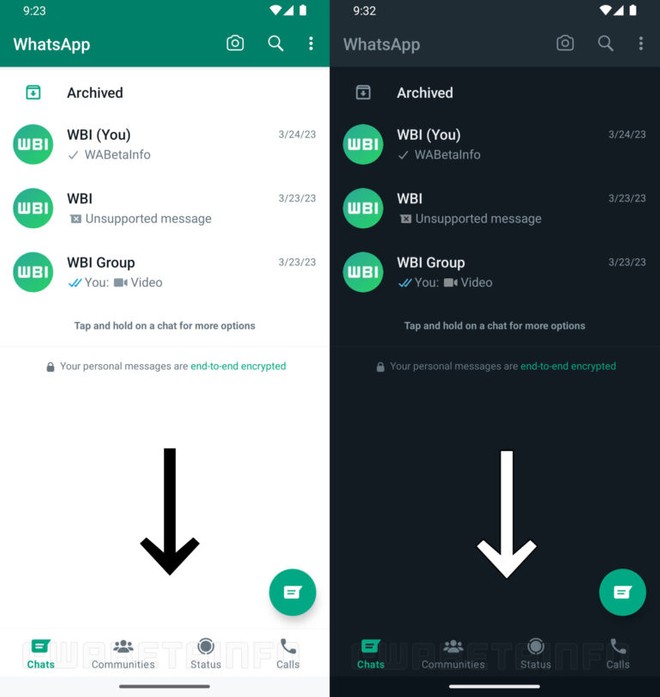
As you can see in the screenshot above, WhatsApp is actually developing an improved interface for the app, with a lower navigation bar. In fact, this change seeks to bring the existing model in iOS to Android.

Having a bottom navigation bar in WhatsApp for Android can provide consistency across platforms as the app differs between iOS and Android, which can be confusing for users switching between the two.

The improved user interface that includes a lower navigation bar is under development and will be released in a future update of the application, yet no official date for the public release of the novelty for everyone.

How about you, did you like this news? Tell us in the comments down below!

>#wrapperApp {-webkit-box-shadow: 0px 0px 5px 1px rgba(0,0,0,0.23);-moz-box-shadow: 0px 0px 5px 1px rgba(0,0,0,0.23);box- shadow: 0px 0px 5px 1px rgba(0,0,0,0.23);padding: 5px;background-color: white;display: flex;height:155px;}#appImage { width: 25%;} #appLogo { width: 154px;height: 154px;}#appDetails { flex-grow: 1;padding-left:1px;}#name {font-size:150%;}#price, #developer, #size {font-size:80%; }#links{flex-grow: 1;padding-left:50px;}.lojaImg {width: 35px;height: 35px;margin-right:3px;vertical-align:middle;}.lojaImgWindows {width: 27px;height: 27px;margin-left:3px;padding-right:6px;vertical-align:middle;}.storesdivs {margin: 5px;margin-bottom:10px;}.storeslinkmobile {margin-right: 6px;}.stores {margin- right:6px;margin-top:13px;}#lojasmobile{display:none;} @media only screen and (max-device-width: 480px) { #wrapperApp {height:auto;}#appDetalhes {padding-left:42px ;}#lojasmobile {display:block;}#lojalinkmobile {font-size:85%}#nome {pading-bottom:4px;margin-bottom:4px;font-size:110%;}#price, #developer, # size {display:none;}.stores{display:none;}.storeImg {width: 19px;height: 19px;}.storeImgWindows{width: 19px;height: 17px;}#appLogo {width: 115px;height: 125px; } }

class=”darkreader darkreader–sync” media=”screen” >