
As you get more comfortable with editing, you’ll probably come across color spaces. Just picking a random color space to edit or export with can cause major issues with your photos, however. Want to know which color space to use and when?
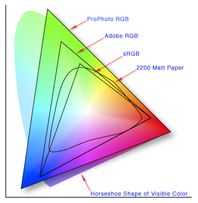
First, let’s take a look at what a color space actually is. The image below is a diagram of some different color spaces, laid over the top of the CIE diagram (a fancy scientific model of all colors we can perceive).
These color spaces have a significant impact on how your image will look in different programs and across different applications. While making a mistake won’t start anything on fire, it can ruin the appearance of your image if you use an incompatible color space with some devices. Colors can be washed out or oversaturated, prints can come out looking off, or the file might get rejected by the online service.
An even more dramatic example just popped up in the news and actually prompted this guide: a badly formatted color space made for a wallpaper that would crash Android devices.
For photographers, a color space can be best understood in the context of what it does for their images: it maps a range of colors into an available “space.” The science behind these spaces, how they came to be defined, and more, is all quite complex. As a photographer, it’s easier to just build a simple mental model of which space to use and when by following a few simple guidelines.
Shooting
If you’re shooting JPEG images, your choice of color space in the camera is significant. Since the JPEG format only offers a limited range of colors without the ability to alter it down the road, you have to choose carefully. Your camera menu should present you with a few choices, typically sRGB and Adobe RGB.
sRGB
If you’re not shooting specifically to print, sRGB is the safer choice. As the format common to web devices and almost every device made in the last 15+ years, no device should have a problem displaying the image. That all sounds great! Why would I use anything else, you might ask. The answer to that goes back to the space diagram. As you can see above, sRGB has the most limited range of any of the usual color gamuts.
Adobe RGB
Shooting JPEGs with Adobe RGB is a tricky thing to recommend. In theory, it offers a wider color space (one that was originally developed to better align with printing), as well as the ability to convert down to sRGB without much issue. In practice, the workflow challenges mean it doesn’t make much sense to still shoot JPEG by the time you’ve gotten that deep into the complexities of color and editing. Put simply, you can shoot Adobe RGB but will end up wanting to convert to sRGB for most applications other than printing anyway.
Are You Shooting Raw?
If you’re shooting raw, you might be feeling left out. Don’t be. A raw image doesn’t really have a defined color space. A raw file isn’t even an image, at least when your camera records it. Instead, it’s a stream of information from the sensor. When you load it into a raw processor, like Lightroom, Capture One Pro, or Luminar, that software can convert the stream of information into an actual picture. At that point, you can choose what color space you want to be working with.
Editing
JPEG
A JPEG image will already have its color space defined. If you set your camera to sRGB, you’re basically good to go. Make whatever edits you want, and save a finished copy of the file. If you shot in Adobe RGB, however, and are planning on sharing your image via the web, social media, or some other non-print media channel, you’ll want to convert back to sRGB.
From Lightroom, you can select your color space on export.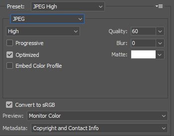
In Photoshop, you can select to convert to sRGB when saving via the “Save for Web” dialog. If you prefer, you can also convert manually by going Edit>Convert to Profile.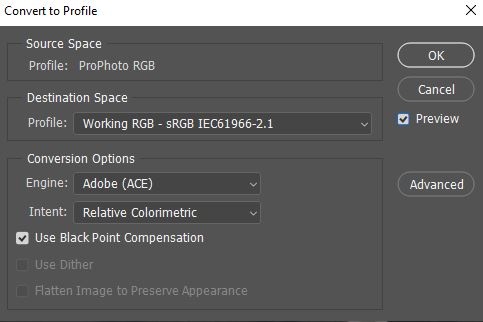
Raw
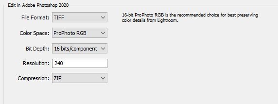 As mentioned, editing is really the first place you have to make a color space decision when shooting raw. When working within editing software like Lightroom, you’ll typically be in the Adobe RGB or ProPhoto RGB color spaces, with Lightroom doing all the development work in ProPhoto to best preserve all the colors your camera captured. Again, this can start to get really technical; for Lightroom, you can just remember that you only need to choose the color space when your image is being exported out of the software to either edit in another program or to create a finished file.
Exporting to Software
If you’re moving an image between editing tools, it only makes sense to preserve as much color information as possible. What this means is don’t choose a smaller color space than the one you started with, unless necessary. Lightroom even reminds you of this in the preference settings.
If you’re working with another piece of software, which may not support this color space, like an older plugin, for instance, you can choose the next best available color space, typically Adobe RGB.
In other editing tools, the same philosophy applies: start with ProPhoto RGB or AdobeRGB if unavailable and plan on finishing your files in sRGB, unless your printer, lab, or publisher requests something else specifically.
Bit Depth
Another thing to keep in mind is the bit depth. Some editing tools will let you choose to work in 8 bit or 16 bit modes. Again, there’s a bunch of math and computer science underlying this, but put simply, a 16-bit image can represent colors with much smoother gradations. Going to 16 bit is especially important if you’re going to be making large tonal changes or using tools to alter tones. An easy example is the gradient tool, which can look blocky under some conditions in 8 bit mode. If you’re working with these larger color spaces, you should probably be working with 16 bits as well.
Wrapping Up
Color gets messy quickly! Fortunately, there are only a few things you’ll want to keep in mind for 99% of your work. Lastly, just remember that because most software defaults to some pretty reasonable selections these days, I’d only suggest changing away from those defaults with good reason.
sRGB: Universally accessible and what your finished file should probably use.
Adobe RGB: Printing and some plugins. If you’re working with a high-end lab or professional publisher, you can give them an Adobe RGB file to get better results, but they have to support it. When moving a raw file into an editing workspace, Adobe RGB can keep more colors than sRGB and might be supported by some editing tools that don’t support ProPhoto RGB. Remember to convert down to sRGB, however, or you’ll end up with washed-out colors!
ProPhoto RGB: The editing workspace that was probably selected for you. Don’t forget to use 16 bits with this one, however. You’ll keep the most colors intact and have the greatest flexibility when editing in this space. Again, you’ll need to convert to sRGB on export for most purposes, however.


