Android
How to see the level of air pollution in your area from Google Maps, on your mobile

-
/home/u233641744/domains/voonze.com/public_html/wp-content/plugins/mvp-social-buttons/mvp-social-buttons.php on line 120
- /home/u233641744/domains/voonze.com/public_html/wp-content/plugins/mvp-social-buttons/mvp-social-buttons.php on line 123
- /home/u233641744/domains/voonze.com/public_html/wp-content/plugins/mvp-social-buttons/mvp-social-buttons.php on line 126
- /home/u233641744/domains/voonze.com/public_html/wp-content/plugins/mvp-social-buttons/mvp-social-buttons.php on line 129
https://voonze.com/how-to-see-the-level-of-air-pollution-in-your-area-from-google-maps-on-your-mobile/&t=
Warning: Undefined variable $post in /home/u233641744/domains/voonze.com/public_html/wp-content/plugins/mvp-social-buttons/mvp-social-buttons.php on line 120
Warning: Attempt to read property "ID" on null in /home/u233641744/domains/voonze.com/public_html/wp-content/plugins/mvp-social-buttons/mvp-social-buttons.php on line 120
How to see the level of air pollution in your area from Google Maps, on your mobile', 'facebookShare', 'width=626,height=436'); return false;" title="Share on Facebook">
How to see the level of air pollution in your area from Google Maps, on your mobile &url=
Warning: Undefined variable $post in /home/u233641744/domains/voonze.com/public_html/wp-content/plugins/mvp-social-buttons/mvp-social-buttons.php on line 123
Warning: Attempt to read property "ID" on null in /home/u233641744/domains/voonze.com/public_html/wp-content/plugins/mvp-social-buttons/mvp-social-buttons.php on line 123
https://voonze.com/how-to-see-the-level-of-air-pollution-in-your-area-from-google-maps-on-your-mobile/', 'twitterShare', 'width=626,height=436'); return false;" title="Tweet This Post">
https://voonze.com/how-to-see-the-level-of-air-pollution-in-your-area-from-google-maps-on-your-mobile/&media=
Warning: Undefined variable $post in /home/u233641744/domains/voonze.com/public_html/wp-content/plugins/mvp-social-buttons/mvp-social-buttons.php on line 126
Warning: Attempt to read property "ID" on null in /home/u233641744/domains/voonze.com/public_html/wp-content/plugins/mvp-social-buttons/mvp-social-buttons.php on line 126
https://voonze.com/wp-content/uploads/2022/06/Como-ver-la-contaminacion-y-la-calidad-del-aire-desde-Google-Maps.jpg&description=
Warning: Undefined variable $post in /home/u233641744/domains/voonze.com/public_html/wp-content/plugins/mvp-social-buttons/mvp-social-buttons.php on line 126
Warning: Attempt to read property "ID" on null in /home/u233641744/domains/voonze.com/public_html/wp-content/plugins/mvp-social-buttons/mvp-social-buttons.php on line 126
How to see the level of air pollution in your area from Google Maps, on your mobile', 'pinterestShare', 'width=750,height=350'); return false;" title="Pin This Post">
How to see the level of air pollution in your area from Google Maps, on your mobile&BODY=I found this article interesting and thought of sharing it with you. Check it out:
Warning: Undefined variable $post in /home/u233641744/domains/voonze.com/public_html/wp-content/plugins/mvp-social-buttons/mvp-social-buttons.php on line 129
Warning: Attempt to read property "ID" on null in /home/u233641744/domains/voonze.com/public_html/wp-content/plugins/mvp-social-buttons/mvp-social-buttons.php on line 129
https://voonze.com/how-to-see-the-level-of-air-pollution-in-your-area-from-google-maps-on-your-mobile/">
The issue of pollution turns out to be quite serious, and specifically when it affects the air we breathe in cities.
For this reason, Google Maps has included a new tool within the app, which aims to show you pollution levels around the worldand everything in a simple way as it always turns out to be in this app.
Although the news that Google was going to release a function to determine the level of pollution and air quality has been known for a while, it is nothing but until now that is being activated in various territories.
Currently this layer, known as Air quality, it is only working in the United States, India and Australia. However, although it is expected that this function will soon be working in Europe, the reality is that you can use it now to see the pollution in the countries that we mentioned.
This is what you must do to see air pollution from Google Maps

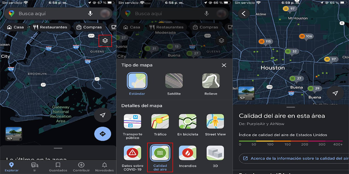
For this, you only need to enter the Google Maps app from your Android or iPhone mobile, click on the layers button, which is represented by two squares one on top of the other and is located in the upper right area, just below the search bar.
Once the layers window is displayed, click on the one that says Air quality and wait for it to load. At this point you will be shown a note indicating There is no information in this areaso you will have to press the button Ward offin order to have a more extensive plane and you can search either the United States, Australia or India.
When you position yourself on one of these territories, you will see some colored points (green, yellow, orange and red). As you must surely already think, these colors will change from green to red depending on the contamination that is over that city.
In fact, you can see a graph that shows the United States Air Quality Index (or the country in question), which goes from 0 to 400+ and the color changes as pollution rises and air quality worsens.
As shown in the file for each place, the information on which Google Maps is based comes from sites like PurpleAir and AirNow.
Meanwhile, in the rest of the countries, including Spain and Latin America, it can always be consulted from aqicn.org/map/world/es/.
-
/home/u233641744/domains/voonze.com/public_html/wp-content/plugins/mvp-social-buttons/mvp-social-buttons.php on line 120
- /home/u233641744/domains/voonze.com/public_html/wp-content/plugins/mvp-social-buttons/mvp-social-buttons.php on line 123
- /home/u233641744/domains/voonze.com/public_html/wp-content/plugins/mvp-social-buttons/mvp-social-buttons.php on line 126
- /home/u233641744/domains/voonze.com/public_html/wp-content/plugins/mvp-social-buttons/mvp-social-buttons.php on line 129
https://voonze.com/how-to-see-the-level-of-air-pollution-in-your-area-from-google-maps-on-your-mobile/&t=
Warning: Undefined variable $post in /home/u233641744/domains/voonze.com/public_html/wp-content/plugins/mvp-social-buttons/mvp-social-buttons.php on line 120
Warning: Attempt to read property "ID" on null in /home/u233641744/domains/voonze.com/public_html/wp-content/plugins/mvp-social-buttons/mvp-social-buttons.php on line 120
How to see the level of air pollution in your area from Google Maps, on your mobile', 'facebookShare', 'width=626,height=436'); return false;" title="Share on Facebook">
How to see the level of air pollution in your area from Google Maps, on your mobile &url=
Warning: Undefined variable $post in /home/u233641744/domains/voonze.com/public_html/wp-content/plugins/mvp-social-buttons/mvp-social-buttons.php on line 123
Warning: Attempt to read property "ID" on null in /home/u233641744/domains/voonze.com/public_html/wp-content/plugins/mvp-social-buttons/mvp-social-buttons.php on line 123
https://voonze.com/how-to-see-the-level-of-air-pollution-in-your-area-from-google-maps-on-your-mobile/', 'twitterShare', 'width=626,height=436'); return false;" title="Tweet This Post">
https://voonze.com/how-to-see-the-level-of-air-pollution-in-your-area-from-google-maps-on-your-mobile/&media=
Warning: Undefined variable $post in /home/u233641744/domains/voonze.com/public_html/wp-content/plugins/mvp-social-buttons/mvp-social-buttons.php on line 126
Warning: Attempt to read property "ID" on null in /home/u233641744/domains/voonze.com/public_html/wp-content/plugins/mvp-social-buttons/mvp-social-buttons.php on line 126
https://voonze.com/wp-content/uploads/2022/06/Como-ver-la-contaminacion-y-la-calidad-del-aire-desde-Google-Maps.jpg&description=
Warning: Undefined variable $post in /home/u233641744/domains/voonze.com/public_html/wp-content/plugins/mvp-social-buttons/mvp-social-buttons.php on line 126
Warning: Attempt to read property "ID" on null in /home/u233641744/domains/voonze.com/public_html/wp-content/plugins/mvp-social-buttons/mvp-social-buttons.php on line 126
How to see the level of air pollution in your area from Google Maps, on your mobile', 'pinterestShare', 'width=750,height=350'); return false;" title="Pin This Post">
How to see the level of air pollution in your area from Google Maps, on your mobile&BODY=I found this article interesting and thought of sharing it with you. Check it out:
Warning: Undefined variable $post in /home/u233641744/domains/voonze.com/public_html/wp-content/plugins/mvp-social-buttons/mvp-social-buttons.php on line 129
Warning: Attempt to read property "ID" on null in /home/u233641744/domains/voonze.com/public_html/wp-content/plugins/mvp-social-buttons/mvp-social-buttons.php on line 129
https://voonze.com/how-to-see-the-level-of-air-pollution-in-your-area-from-google-maps-on-your-mobile/">


