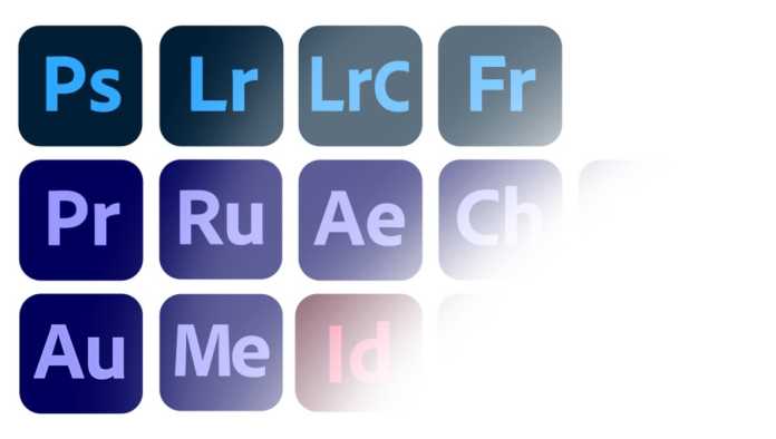
I love Creative Cloud’s constant updates, but I’m not sure this tweak will prove popular.
Adobe’s June update has included some tech forward photography updates, and further embedding of their stock services. This is off the back of their smartphone release, “Photoshop Camera.” So it’s been a busy week.
While I appreciate their new font finding tool, I don’t appreciate the icons’ new look. Adobe has decided to group their apps together, by color. Admittedly, I can see where Adobe’s coming from, but I think this will prove more annoying than clever.

Why Adobe Is Doing This?
Adobe’s Creative Cloud has too many apps. Any reasonable consumer doesn’t need them all. When the icons are uniform, it makes Adobe’s product clearer and easier to understand. Perhaps that’s easier to sell? Now we know that After Effects is in the same family as Audition.
I suspect this change also pertains to Adobe’s shift to mobile. The goal is for the mobile and desktop experience to be congruent. With the icon update, they can continue down this route and mitigate confusion. We have rounded corners for every app.

Confusion
It irks me that a company so synonymous with design, could design something so frustrating. Not only do the app icons look the same, the saved project files look the same too. I’m already bad at opening the right project file, I don’t need Adobe to confuse things further.
Then there’s the obvious – these apps have a legacy. Now every Lynda (and Fstoppers) tutorial will have the wrong color icon, which can only hurt beginners. The professionals will hardly be thrilled, when Creative Cloud iconography is so ubiquitous it counts as a keychain.
In particular, I’m mildly irritated that Audition was clumped in with the video suite. The entire app is themed with a green tint, and the new icon isn’t even remotely what it was before. It looks like Dimension and Aero are the only green icons left, now that Muse has been killed off.
What do you think about the new icons? Will it make life harder, or easier?


