YouTube Music rearranges settings on Android | It starts with tablets

YouTube Music is starting to update on Android with a layout a little more rational and better organized for the settings: we start from the world of tablets, folding smartphones and Chromebooks – essentially in devices with large displays, a product category on which Google has recently renewed its commitment in view of the release of a foldable Pixel Notebook and a Pixel Tablet ( naturally provisional names).
Specifically, the service settings appear in a pop-up menu instead of being full screen. You always have to press the icon of your user profile, but in this way it is more practical and preserves the flow of the session of use. In addition, the entire settings menu is organized in a two-column layout, with the categories and navigation menu on the left and actual pages on the right.
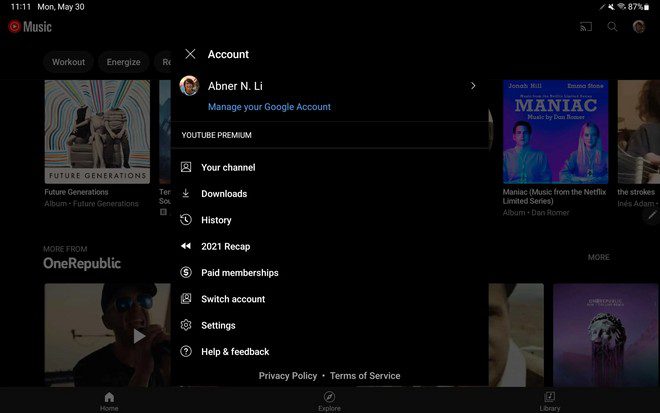
This stylistic tweak is pretty standard for the tablet-optimized Google apps we’ve seen so far. Better organization and categorization is also observed, rather than simply offering one very long list of toggles and options as it currently happens on smartphones. The double column layout is perfect for this kind of more structured and rational approach.
It is interesting to observe how essentially Android smartphones remained the last category of device to offer the long and inconvenient toggle list. Category grouping is also present on Apple’s platforms – not just iPadOS but also iOS, albeit in a different form. It is therefore reasonable to expect an alignment, at least with what is offered on the iPhone, in the future.


