
A week after the distribution of the revised widget with a view to the expressive Redesign, also the app of Google Drive Start receiving the first elements in sauce Material 3 Expressive.
Research bar magazine, the latest generation selection icons with a revised style and fab are in distribution gradually and also rather “random”, entrusted to the usual server rollouts so loved by Google.
Follow Google Italia on Telegram, Receive news and offers first
Google Drive: the expressive redesign is in rollout
The Google Drive app is also welcoming the Material 3 Expressive. After the first clues of early July, it seems that the Mountain View giant has given the green light for distribution on one of its services most used by Android users (and on any other platform).
Starting from above, we can see the New search bar. It is thicker than in the past and is placed in the center. The Hamburgher menu (button with the three horizontal lines) has been moved outside the search bar, in this case on the left. Even the Avatar of the Google account, as well as access to the other any accounts configured (or to be configured) on the device, has been moved outside the search bar, in this case on the right.
Immediately below the search bar, which still has the old design in the following image, we find i Renewed selectors for vision files (between list view and grid view) that took the place of the single switch button.
The element is typical of Material 3 Expressive And the current view is designed to emphasize in two ways: highlighting it in contrast (turning the color scheme of the theme set on the device) and moving on to a “pill” shape. The other option features a geometric-like geometric shape but with the external side which is a circumference arch.
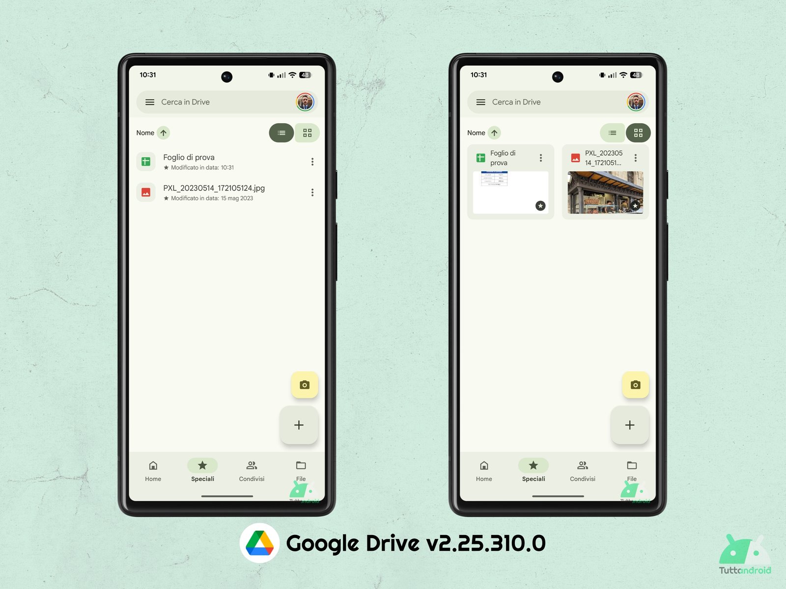
Going down below, we find the new menu of the Fab (Floating Action Button) or floating button. The button with the “+” does not change in the shape or color but, by making a tap on it, we will be welcomed by something different but which knows already seen (it is on the same wavelength as Google Keep).
Instead of the “sheet” appearance from below, the various options (which remain unchanged) have been arranged inside a menu with a transparent background that develops from the bottom up, with the six options contained between the “X” button (to close the Fab menu) and the “Camera” button (to access the scan of documents).

We discovered these elements in style Material 3 Expressive with the version 2.25.310.0 Of the Google Drive app for Android but, as you have noticed by the various screenshots, we have not experienced them all together on the same device but on three different devices. It may be necessary to wait a little longer before the complete Redesign is actually available for everyone.
How to download or update the Google Drive app
To download or update the app Google Drive On Android smartphones it will be sufficient to reach the page dedicated to the app on the Google Play Store (via the Badge below) and make a tap on the button “Install” (in case you want to try the app for the first time) or “Update” (in the event that you mark the presence of an update).
![]()