
Google is preparing to renew the visual experience of one of its most important applications for user’s safety, Personal emergencies; From the analysis of the 2025.06.12.77286699.3 version of the app, numerous graphics have emerged that update the software to the design language material 3 Expressive.
Let’s see together all the details of this restyling and the implications for those who use the app in emergency situations.
The personal emergencies app refers the look with the Material 3 Expressive style
The personal emergencies app has long been a point of reference on Android for the management of emergencies, the software offers different features from the detection of road accidents, to the management of contact information for emergencies, the possibility of asking for help quickly or receiving information in case of urgent needs; In fact, not only for Pixel users, considering the usefulness of the tool in question, the company has decided to make it available through the Google Play Store for any device of any manufacturer.
Now Google has decided to give the app a more modern visual imprint, in line with what has already been seen on various owners software; The main changes concern:
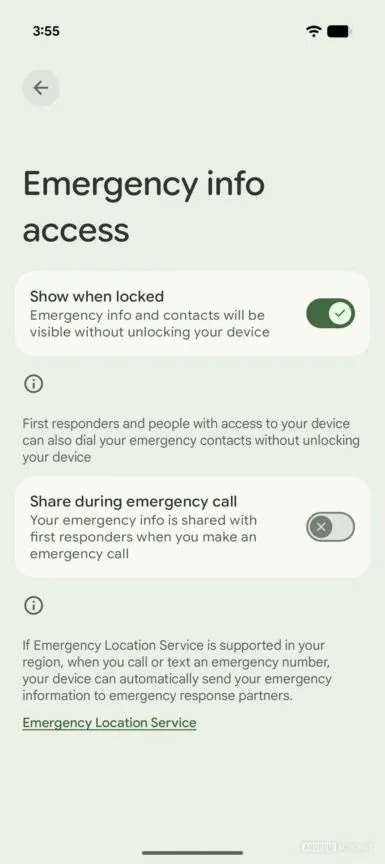
- Bolders To make the consultation of the main sections more immediate
- white boxes with division lines that frame the information fields clearerly
- Redisegnati selection buttons with check icons or x that replace the old indicators
- The button Add contact transformed from a simple text field to a green pill -shaped button, decidedly more visible.
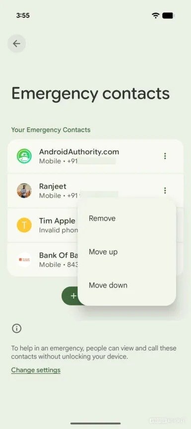
One of the areas that receives most attention is that of emergency contacts, essential to quickly activate requests for help: the old interface involved an icon in the shape of an X next to any contact, useful to remove it in one touch, while the reorganization required to access a separate screen via the appropriate button at the top; With the new design instead, Google introduces a Three dots menu for each contactthanks to which it will be possible to remove and reorder.
This novelty makes the management of contacts more ordained and intuitive for those who want to change their priority, however, quick removal needs now more than the simple touch on the X; It is therefore a change that may not like to everyone, especially in situations where every second counts.
According to what emerged, this restyling of the personal emergencies is probably exclusive to Android 16 QPR1, at least in a first phase, the main clue is that the emergency contacts section as well as being accessible via the app, is also integrated into the system settings under security and emergencies, which Google is updating parallel to the next release.
It would therefore not be surprised if this new version was distributed as part of a wider package of updates linked to QPR1.
This update of personal emergencies confirms Google’s tendency to bring the Material 3 Expressive on all the main services, the new interface does not upset the functions of the app, but aims to standardize the visual experience and make it more consistent with the Android ecosystem.