
The restyling of the Google app continues relentlessly, after seeing various graphic updates for different software developed in that of Mountain View is now the turn of Google Photo; thanks to what is identified by Assembradebug We can first look at some aesthetic innovations that the app could receive, in line with the provisions of the increasingly pervasive material 3 Expressive.
A Redesign that aims to improve visual coherence between the various applications of the Google ecosystem but which, as we will see, could discuss for some choices not exactly aligned with the preferences of all users.
New video reader and new page of search results for Google Photo
We start from the most evident novelty, the one that immediately jumps to the eye as soon as the reproduction of any video saved in Google photos, the new video player, identified in version 7.32.0.765953717 of the app presents itself with a completely redesigned interface, which goes far beyond the simple aesthetic retouching.
The most flashy change concerns the timelinenow decidedly more visible and functional, enriched by one vertical bar who is the guide to the sliding icon and from the Video Duration View positioned directly above; There is also the set of multimedia controls (pause, volume, etc.) much more accessible than in the past, with the arrival of New button Add to which is accompanied by the already known Share, Change And Basket.
Another small but significant difference concerns the date display and time of the filenow shown in the upper part of the reader, an addition that will like to those who usually catalog their multimedia content carefully; it is instead the transmission icon disappeareda choice that could disappoint those who frequently exploited the cast functions.
But it did not end here, one of the most interesting additions concerns theIntroduction of quick gesturesholding down on the right or left side of the screen will in fact be possible advance or rewind the videoa function that winks at the YouTube user experience and which will significantly improve navigation in the longest content.
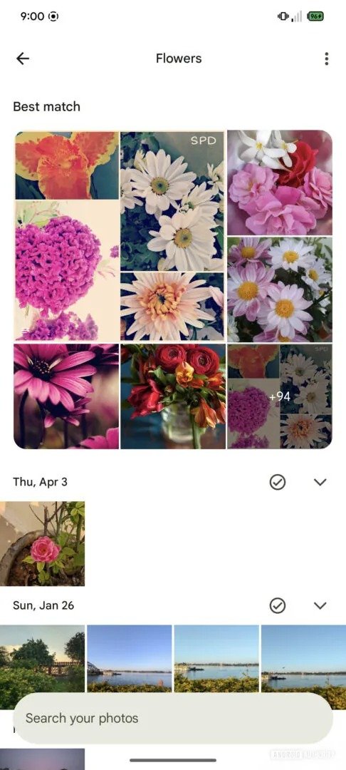
In addition to the video reader, Mountain View developers are also testing another rather significant change, this time dedicated to search results page; Here the news are more controversial, the interface has been simplified and reorganized, with the Research bar that moves down and a new layout that groups the Best correspondences in a square gallery in the upper half of the screen.
This section is flanked by a list of results per date, but the general viewing shows less elements at the same timepotentially forcing the user to a more frequent sliding; An apparently banal detail that could affect the speed of consultation, especially for those used to navigating in large photographic bookcases.
The current version on the contrary, presents a single gallery that includes both the best correspondences and the most recent ones, making many more options immediately visible.
Vale thinking to emphasize that the listed innovations are not currently available for ordinary users and could, in part or completely, never get to the stable version of the app; Nonetheless, the general aspect of these new interfaces seems perfectly in line with the Material 3 Expressive language, now increasingly central in the visual identity of Android 16.
The restyling therefore aims at greater harmony among the apps, but will also have to prove effective from a functional point of view, especially considering that Google Photo is one of the most used and appreciated services within the ecosystem. At the moment there are no precise indications on a possible large -scale distribution, we will therefore have to wait a little more before Google makes available for all the changes just seen.


