
Google Keepthe Google multi-platform app that allows you to create, modify and share notes, lists and reminders, is changing to adapt to the new design philosophy Material 3 Expressive of the Mountain View giant.
The first clues to the app had already emerged in May but, now that we are approaching the release of Android 16 QPR1, more and more apps and services made by Big G are receiving the update. In the last few hours the rollout has also been started for the notes app.
Follow Google Italia on Telegram, Receive news and offers first
Google Keep: the expressive redesign is in rollout for everyone
In recent months, step by step, Google is trying to revolutionize the user interface of their apps, their services and the Android operating system to implement the fees of the Material 3 Expressive.
With this in mind, Google Keep is only the last of the Mountain View giant apps to receive the expressive Redesign, in the process of distribution for users after having long been “hidden” (the last update in this regard is at the beginning of July).
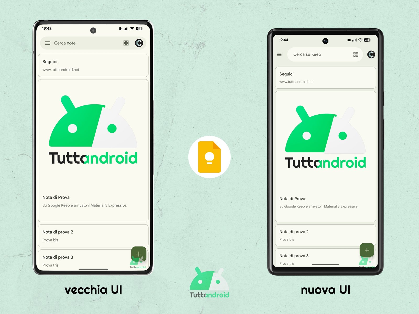
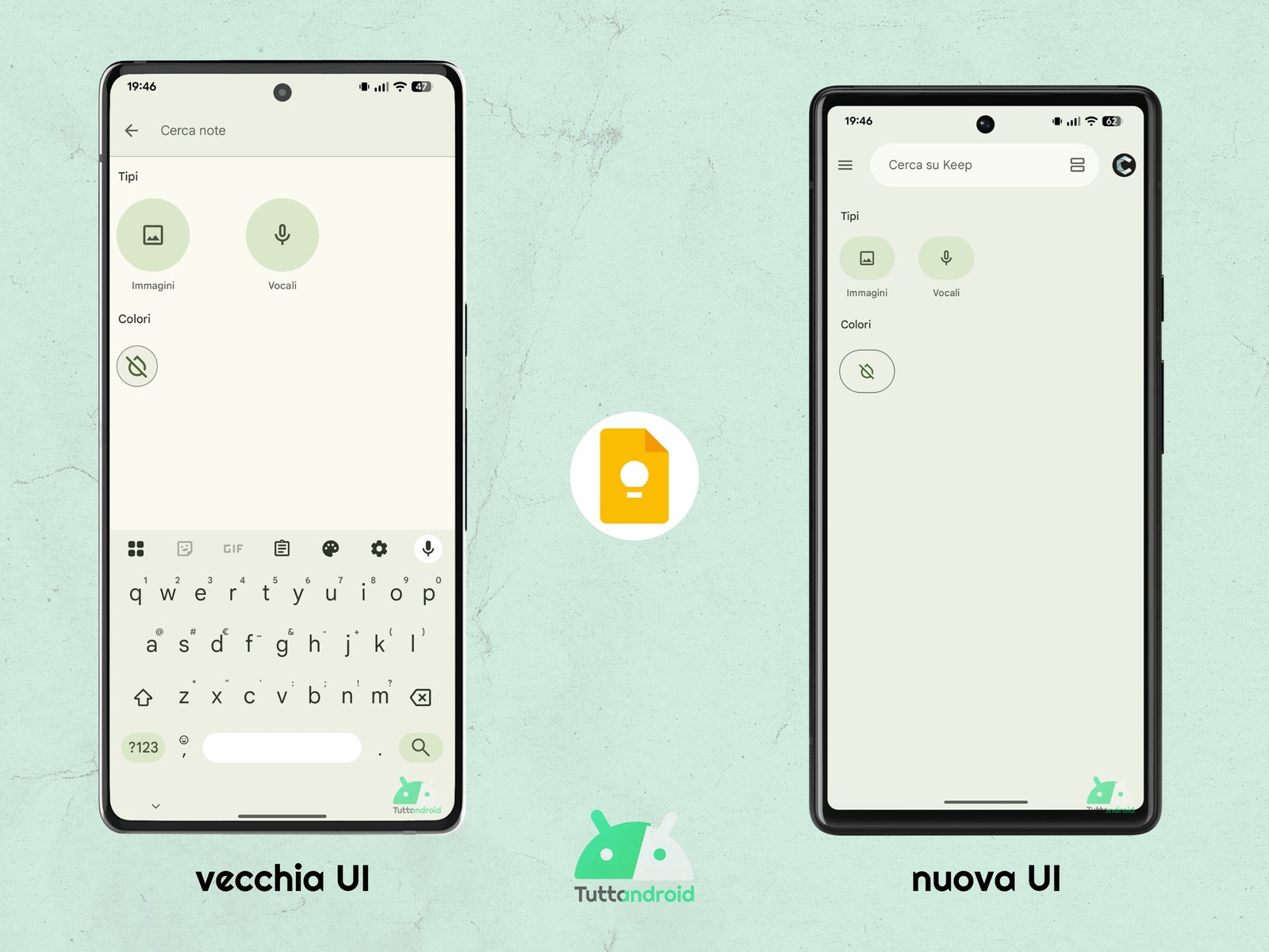
In the initial screen, where the FAB (Florating Action button) remains which was revised at the beginning of the year, the most evident novelty is the New search bara component that does not extend more for the entire width of the screen but is in the central part, with the Hamburger menu on the sides (three lines) and the avatar of the Google account.
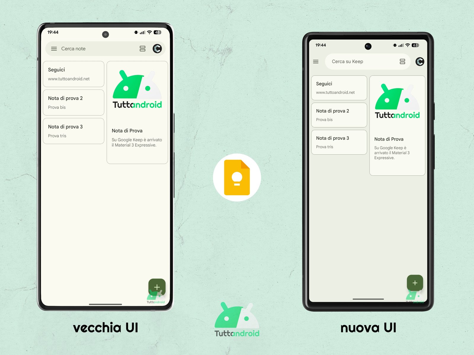
At the end of the loading of the app, the writing “disappears”Google Keep“And in its place the wording appears “Search on Keep” who took the place of “Look for notes”. On the other hand, the notes of the notes do not change, both in the single column display and in the view to multiple columns. The most attentive will notice a greater contrast between background and individual notes. The hamburger menu remains the same available previously.
By entering a note, we discover that the differences invest the upper part of the screen, the one before the real portion intended for the text of the note starts. It has a greater contrast with the background than before, better marking the “detachment” between the two parts.
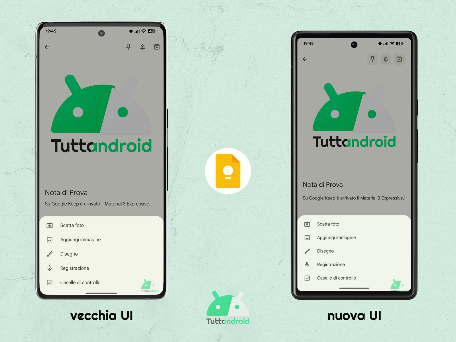
Going further, all the buttons of this part (net of the one to go back) were transformed into circular buttons with icons inside (before they were icon and that’s it). The available functions do not change.
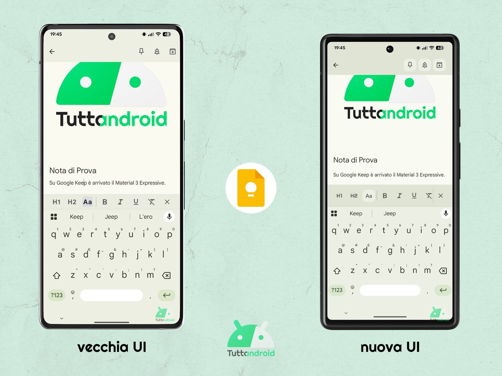
All the instruments at the bottom were also enclosed inside circular buttons with an icon inside but all the sub -men remained identical, except for the formatting of the text that has a revised design.
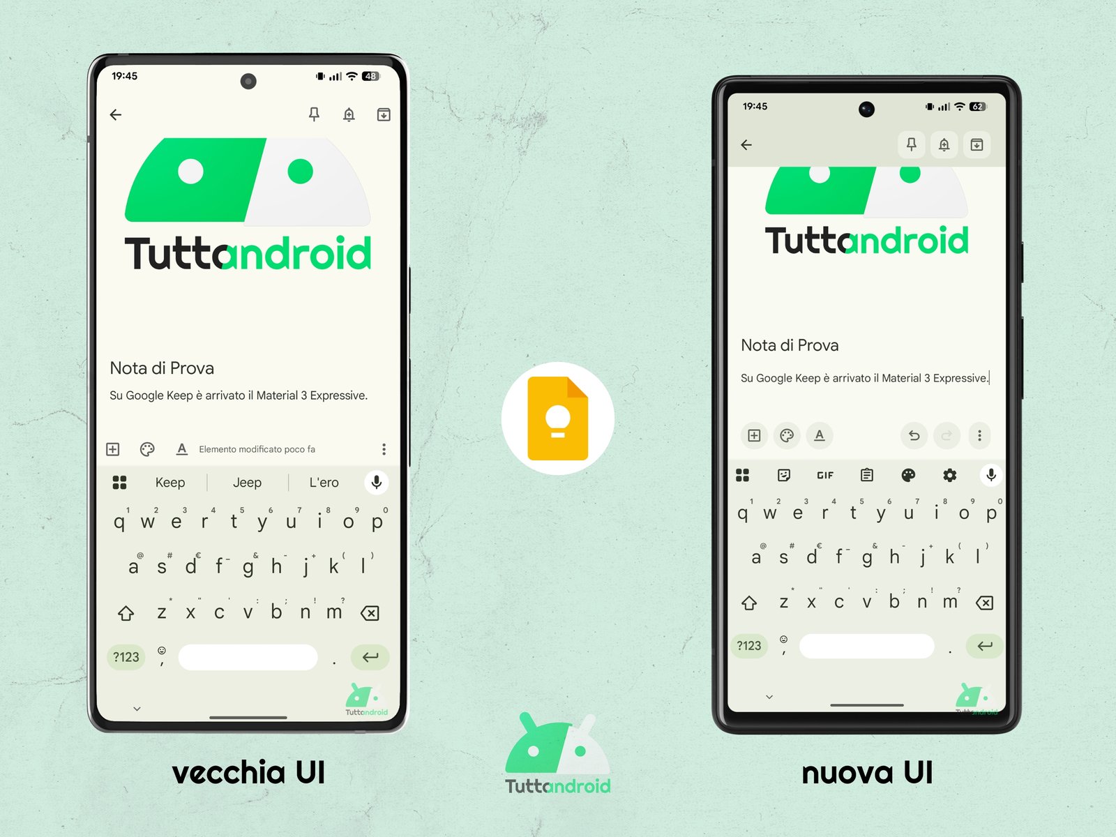
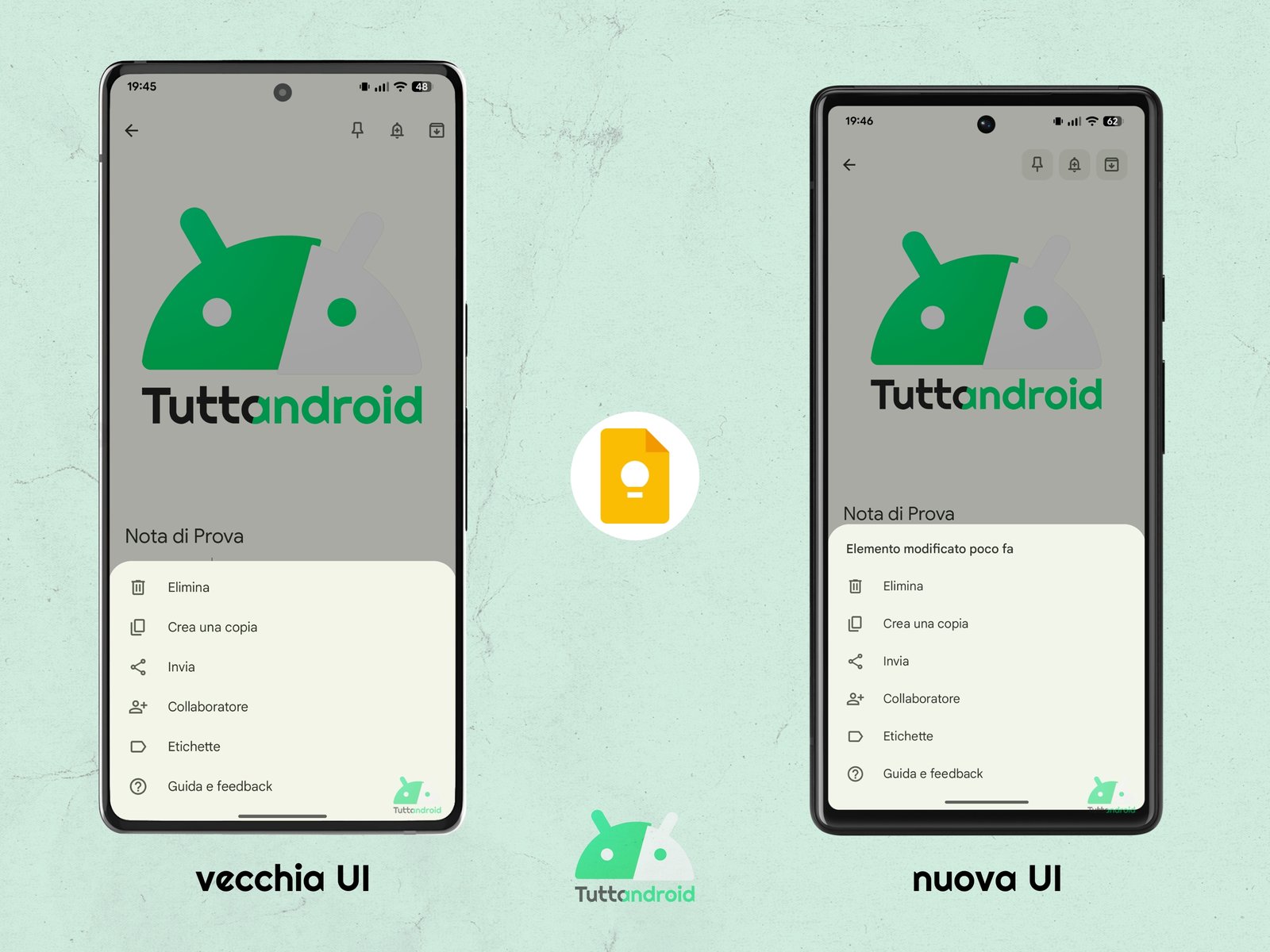
Another difference with the past lies in the elimination of information on the hour (or day) of the latest modification: in the old UI it is present next to the formatting tools icon; In the new UI it was included in the menu “Other“(The one with the three dots present on the extreme right of the toolbar), highlighted in the upper part.
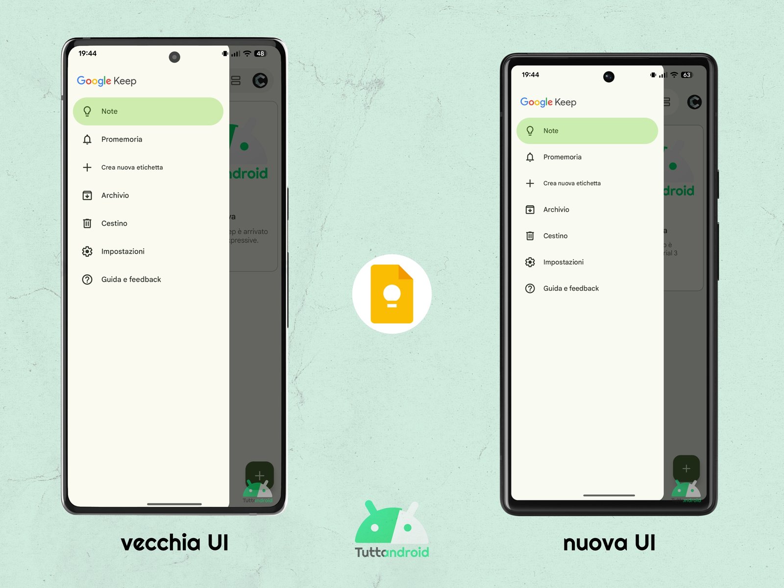
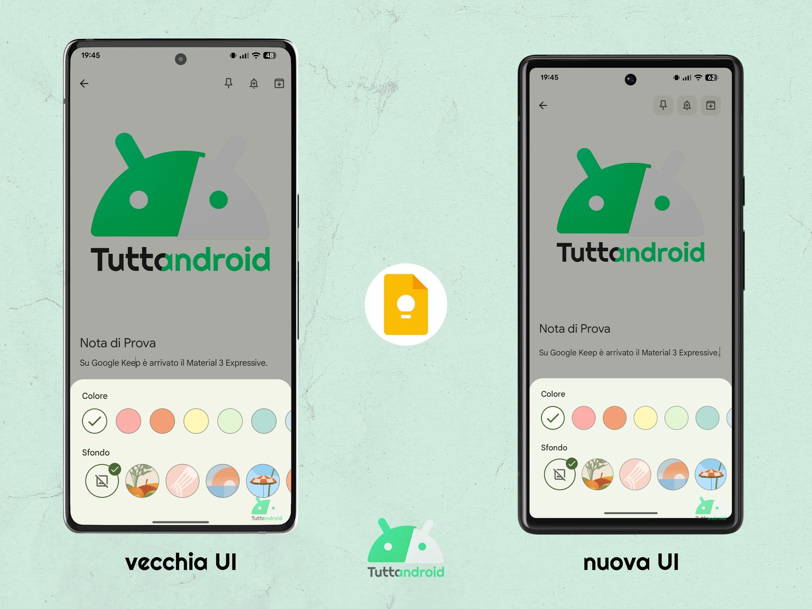
The last difference can be found in the menu that can be accessed by carrying out a tap on the Google Keep search bar: the screen does not earn new features compared to the past but gives a criterion to the available tools (in this case of the types of note or the colors of the note).
As anticipated, the design in Material 3 Expressive is in Rollout for everyone (gradual, server side) on Google Keep But they may want days/weeks before it reaches all users. However, we advise you to verify that the latest available version of the app is installed on your device.
How to download or update the app
To download or update the app Google Keep: notes and lists On an Android smartphone it will be sufficient to reach the dedicated page on the Google Play Store (via the Badge below) and make a tap on “Install” or “Update”.
![]()


