The Google Document app is preparing to receive a nice renewal of the user experience. Thanks to a Teardown of the latest version of the app, three important news emerged in the test phase: New research filtersthe long -awaited Material 3 Expressive and a layout designed for a more comfortable use with one hand. Let’s find out the details.
Index:
- Google Docs ready to renew the interface with three concrete news
- Smarter filters
- The eye also wants its part, the Material 3 Expressive arrives
- The format moves down and becomes more ergonomic
- Release timing
Follow Google Italia on Telegram, Receive news and offers first
Google Docs ready to renew the interface with three concrete news
Google Docs has been a point of reference for mobile productivity for years, offering a solid balance between functionality and simplicity that have helped to make it a pillar in the workflow and study of millions of people all over the world.
However, as we often tell you about these pages, Google is always looking for room for improvement, and the latest version of the app (1.25.381.00.90) reveals that a renewal of the interface is around the corner.
Three main aspects on which the company is intervening: new filters for the search for documents, the long -awaited graphic restyling in Material 3 Expressive style and a reorganization of the commands for more ergonomic use.
Smarter filters
The first novelty that emerged from the analysis of the code concerns the introduction of Three new filters in the search function.
So far, finding a document in Google Documents from Mobile asked to type a keyword or scroll through the recent cards. Soon, however, it will be possible to refine the results with these three parameters:
- File type: allows you to select the document format (text, calculation sheet, presentation, etc.);
- People: filter the files based on collaborators or the owner of the document;
- Recent modification: allows you to narrow the results according to the time interval in which the last file was modified (last 7 days, 30 days, this year, last year, or a personalized interval).
A functionality that clearly takes inspiration from the advanced research systems already present on Google Drive Ed Gmail, but which is now integrated directly into the DOCS app for Android.
The images that emerged from Teardown They show how the search interface is updated to host these new checks, with a cleaner and more accessible layout.
The eye also wants its part, the Material 3 Expressive arrives
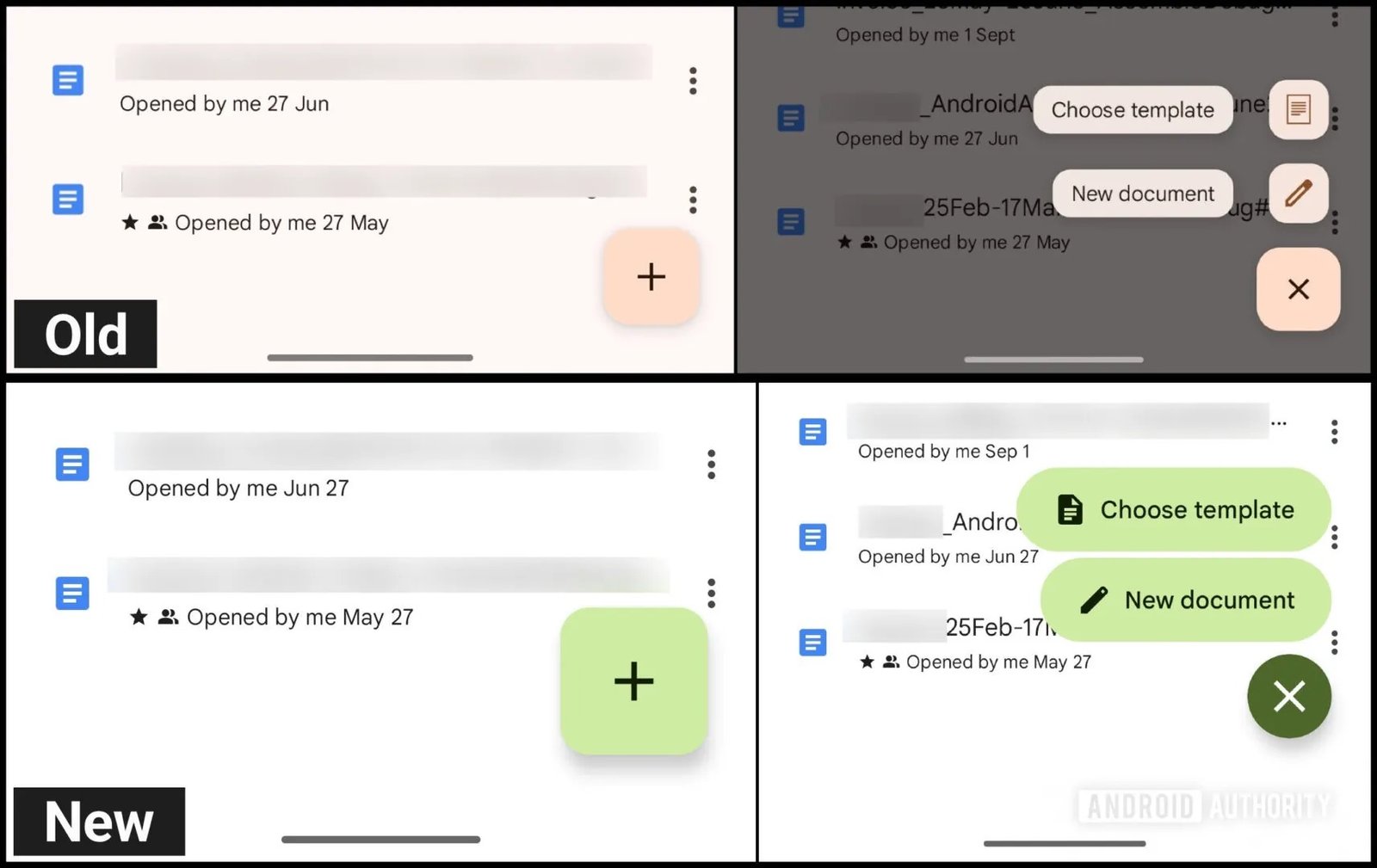
The second novelty concerns the design of the interface, in particular the Floating Action Button (Fab), the “+” floating button that allows you to create a new document.
In line with the new graphic language material 3 Expressive, Google is testing a Fab visual restyling. The button keeps its position but changes shape and style: the “+” icon becomes more marked and the two pane that allow you to choose between the document or sheet are enclosed in pill containers, with the icons moved inside the buttons themselves.
A small aesthetic update that modernizes the app and makes it consistent with other Google services that have already adopted Material 3 (such as Google Drive, Keep, Calendar and many others).
The format moves down and becomes more ergonomic
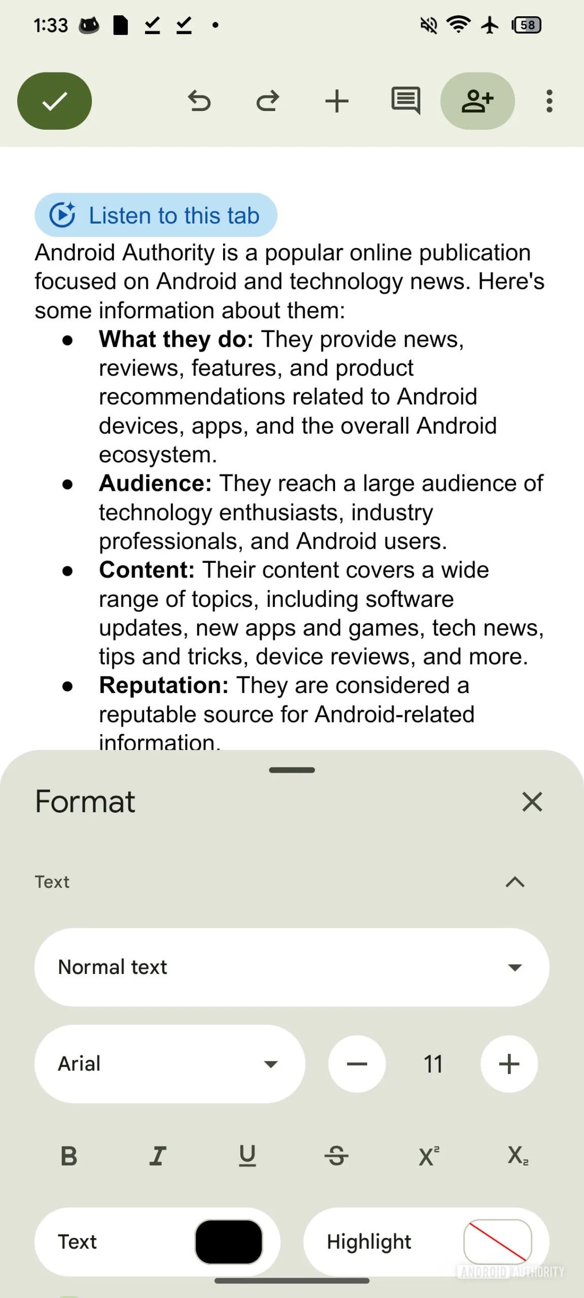
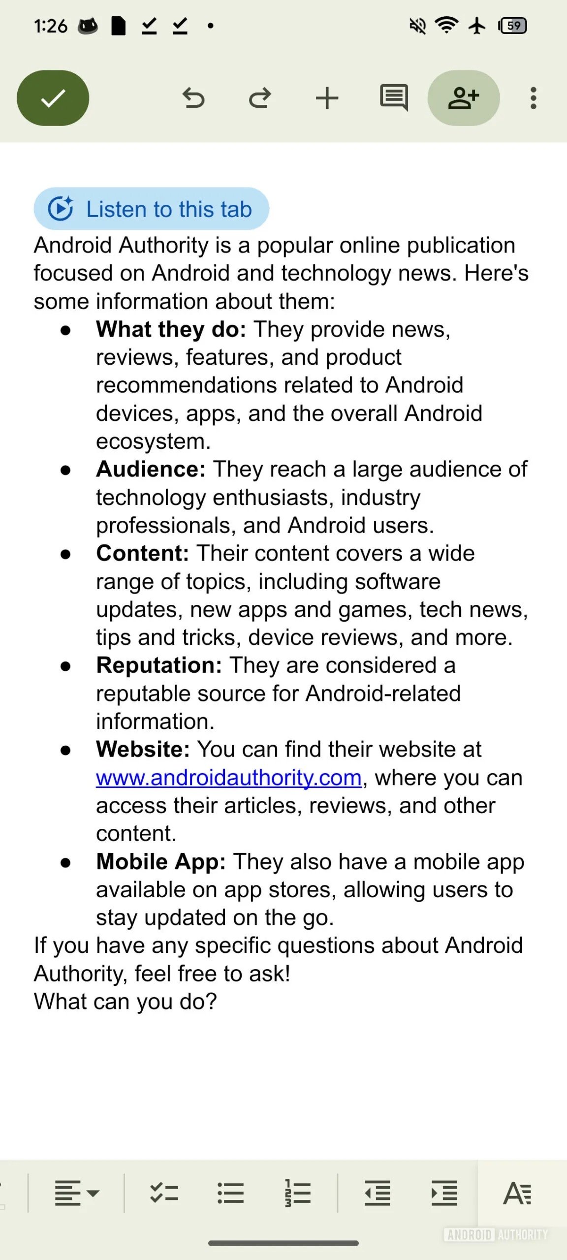
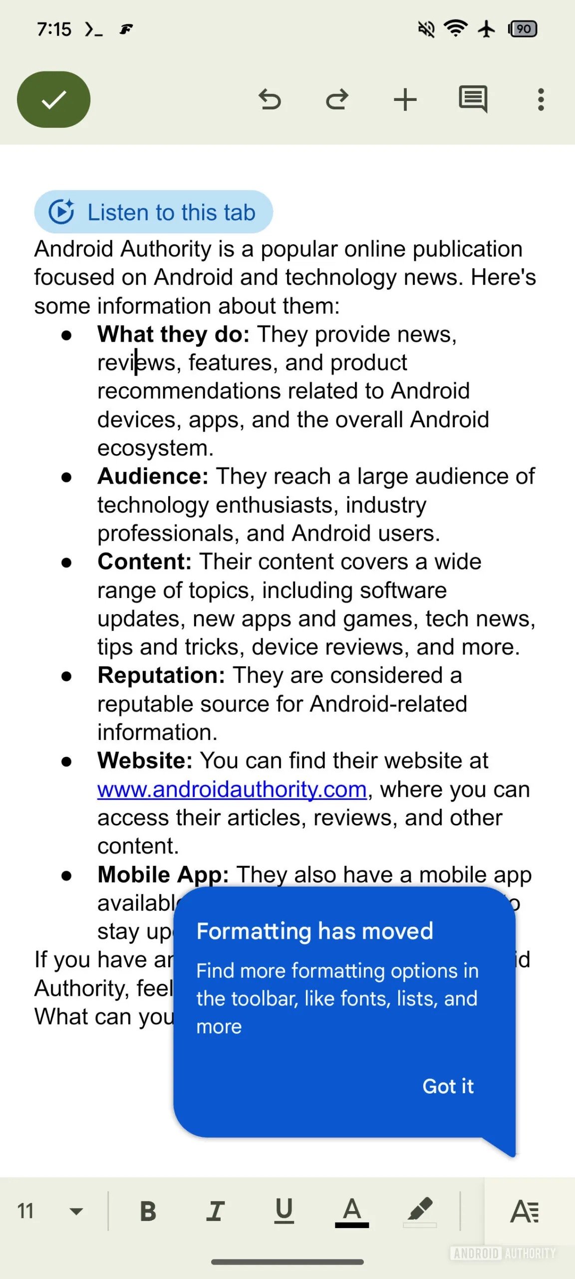
The third modification is perhaps the most significant regarding daily usability: as you can see from the images, Google is moving the formatting panel from the top edge of the screen to the lower bar.
In this way, options such as bold, italics, episodes and text size lists will be more easily reached with the thumb, especially when you keep your smartphone with one hand.
The change is designed for Improve ergonomics during mobile use And it reflects an increasingly widespread trend in modern apps: to move the main checks down to facilitate access.
Not only that, in fact, the new lower bar will also be horizontally smooth, allowing you to quickly access other commands which were previously available only by opening the complete formatting panel.
Those who use Google documents on tablets, foldable or in horizontal mode will continue to see all the controls visible simultaneously, without the need for Scroll.
Release timing
Although these changes are still in development phase And not publicly available, Google is likely to be tested internally the news before proceeding with the stable rollout. It is not yet clear whether they all arrive at the same time or progressively.
It remains to be understood when these news will be officially available and if they will also be extended to the iOS version of the app.
What is certain is that Google aims to make documents more modern, intuitive and adaptable to new devices and new habits of use.
Attention to the form with the material 3 Expressive, the greatest ergonomics and the new filter options are evident signals of Google’s will to make the experience of using the app increasingly updated and mature.

