
Among the different weather apps available in the Android panorama, Accuweather It has always distinguished itself to be precise of its forecasts, while presenting (at least until today) a rather essential interface with respect to what is proposed by the competition; However, it seems that something is about to change.
With the arrival of version 21.0.9 Beta, in fact, Accuweather is introducing an important graphic restyling of its app for Android, making it more modern, colorful and legible; Let’s find out all the aesthetic innovations introduced.
A whole new design for the Accuweather AP
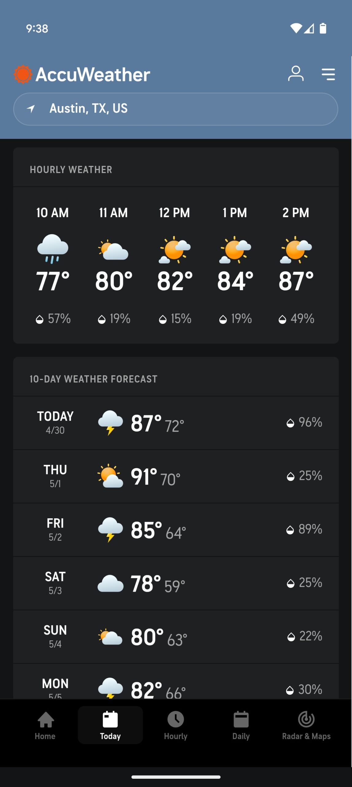
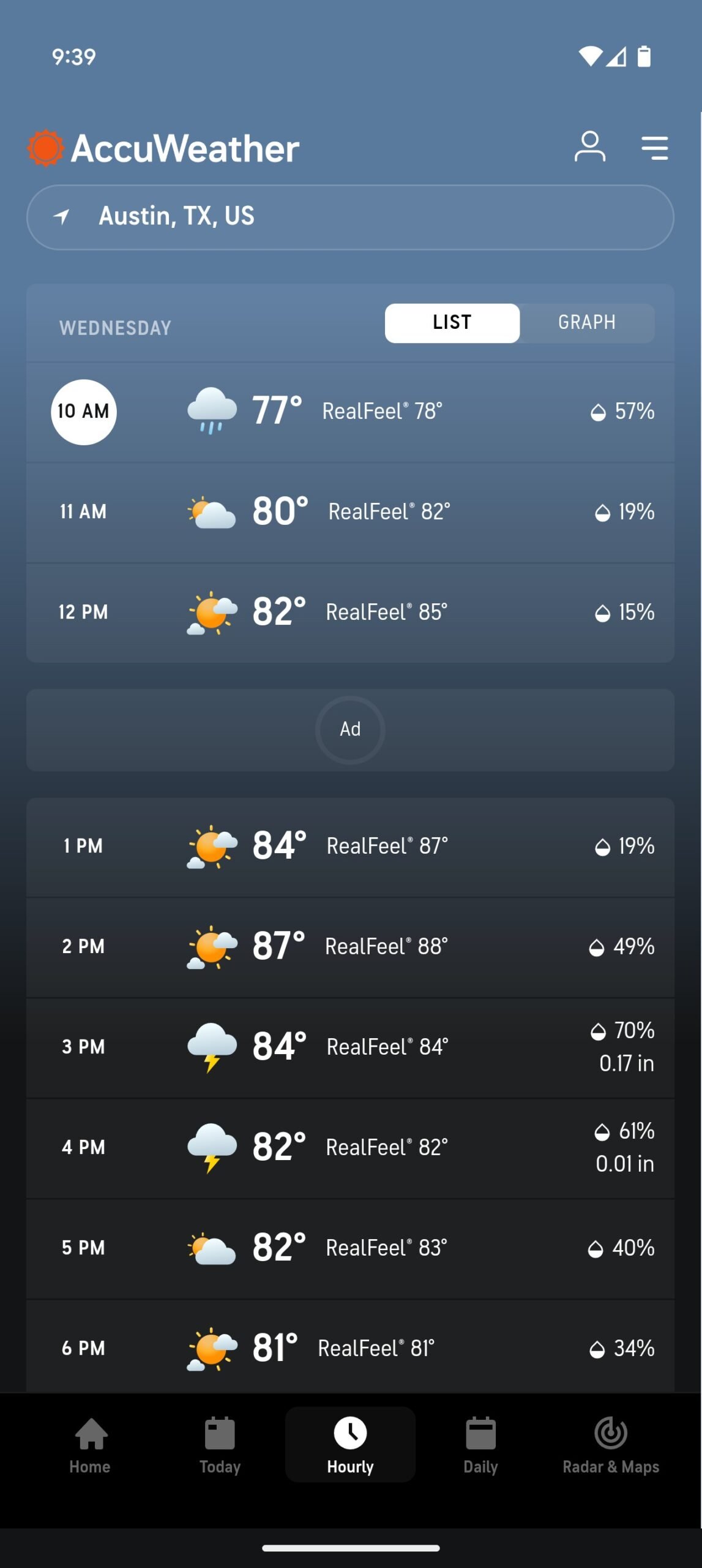
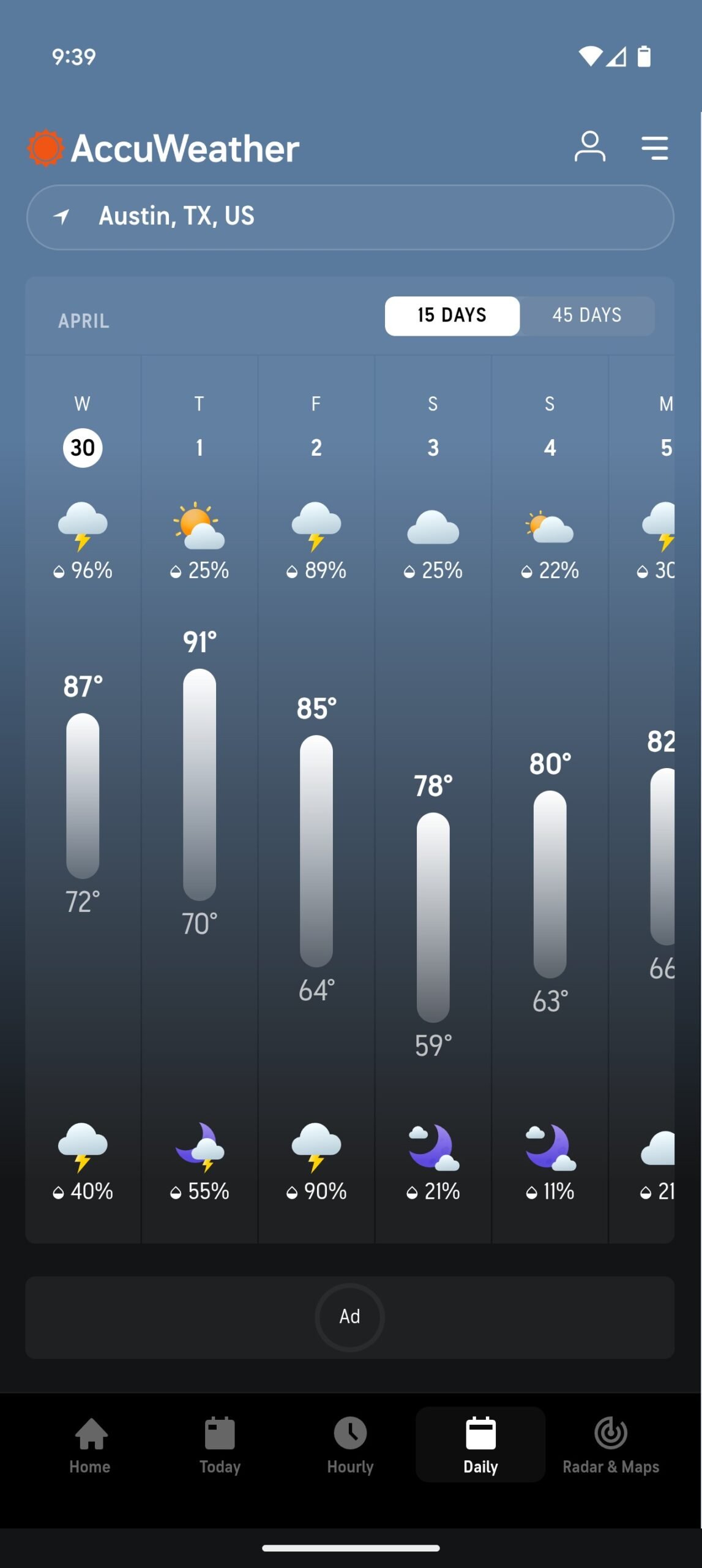
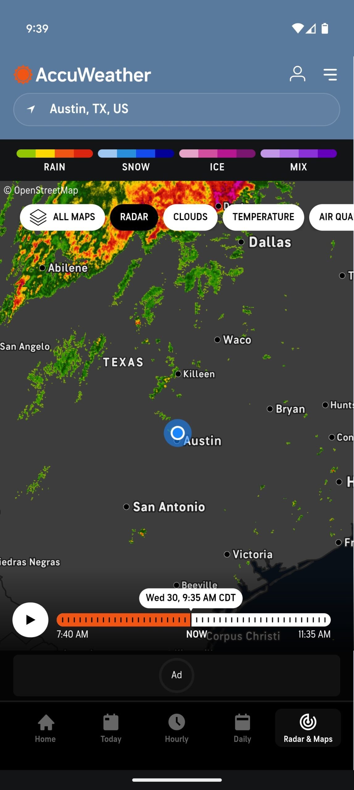
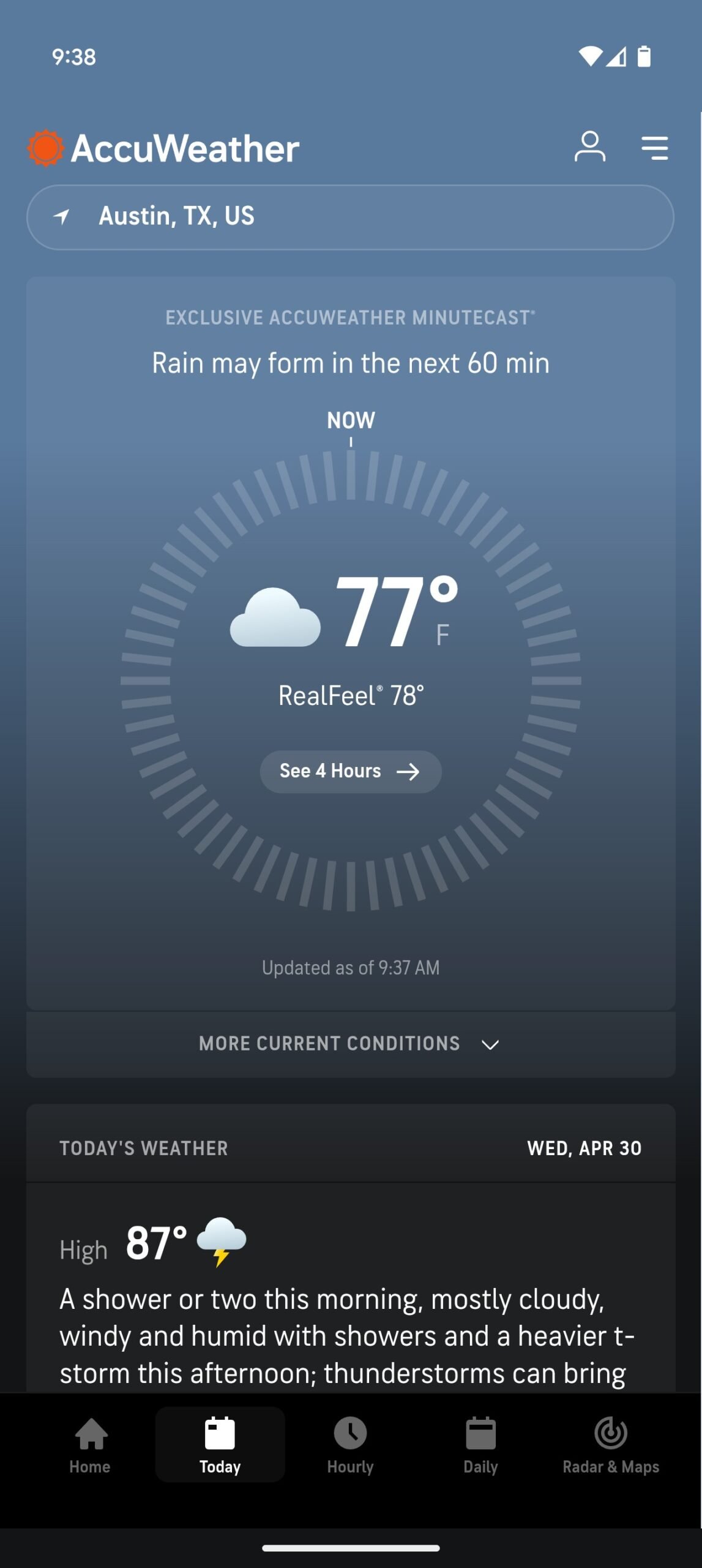
The graphic renewal involves the app in its entirety, starting from the homepage to the main sections such as today, timetable, daily and radar/maps; The differences immediately jump to the eye, the contents now lean on large translucent cards creating a more dynamic visual effect, where the weather icons have also been redesigned by going from simple white outlines to full and colorful elements, decidedly more pleasant to be viewed at a glance.
Even the text present within the app benefits from a more marked contrast, which improves its readability in all light condition. The cards bar, which allows you to browse quickly between the various sections, has in turn received an update with icons more consistent with the new visual style.
Some noteworthy details include:
- The Hamburger menu is now positioned at the top right
- The Accuweather logo has become larger
- The location selector is now enclosed in an elegant pill -shaped element with a large side spacing
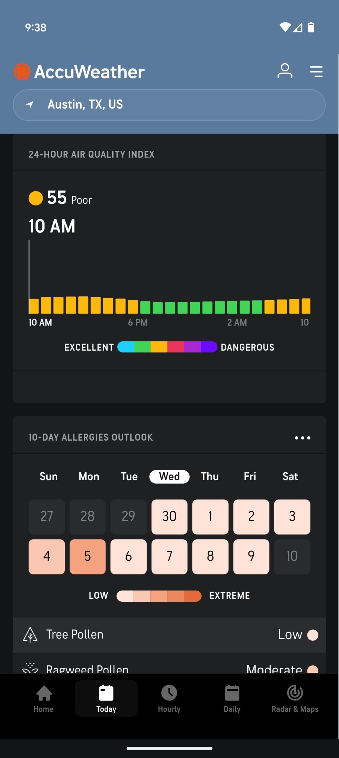
- The graphs related to air quality and allergens follow the same lively and multicolored visual style
- The maps section benefits from a graphic refresh in line with the rest of the interface
In short, everything appears more cared for and visually rewarding, without giving up the features that have made Accuweather one of the most appreciated apps of the category.
The decision that led the development team to test the newly viewed graphic changes is probably the result of a necessary evolution, especially in a context in which the weather apps pre -installed on Android phones (such as that of Samsung or Google) are focusing more and more aesthetic and customization.
The new restyling of the Accuweather app represents an important step forward in terms of user experience, and demonstrates how historical and long -standing apps can also be renewed without losing their identity; If the accuracy of the software forecasts will remain unchanged, this new version could confirm the primacy of the software as one of the most complete and pleasant weather apps to be used on Android.
As mentioned at the opening, the graphic restyling is currently available in the beta channel of the app which, however, on the Google Play Store, is currently at the time; If someone among you equally want to test the aesthetic changes just seen with your hand, simply contact the Apkmirror portal to proceed with the download of the latest beta version available.