
Apple has decided to update the iCloud.com site giving it a modern touch and adding graphics that give a nod to the look users are used to using iPad. Everything is contained within tiles that, similar to widgets, show a lot of information from all the services offered, such as photos, notes, mail, Find my iPhone and moto more.
The change from the previous version is quite drastic, in fact, remember that before the site showed only a handful of icons that served as links to web apps, an aspect that had remained static for years.
Of course now the page can be customized and it will be possible to choose which apps to display in each tile or completely remove some of them. Here are the two versions compared: on the left the new one, on the right the old one.

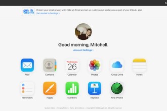
The bottom of the page shows your storage plan and iCloud usage, as well as a link to recover recently deleted files from iCloud Drive and other apps. In the top menu bar, users can click or tap the plus sign to create a new email, note, calendar event, and more. The menu also provides access to settings for iCloud+ features such as Hide My Email, iCloud Private Forwarding, and HomeKit Secure Video.
Finally, there are no new or revolutionary featureshowever for those who are used to using the web version, the new graphics should improve the overall appeal.
Among the most interesting innovations in terms of expanding functionality between services of different companies, in recent times has arrived the integration between iCloud Photos and Windows Photos. The feature was announced by Microsoft in October and should be available to all Windows 11 users by the end of November.


