
After this summer’s previews of the Canary version of Google Chrome and the first changes to the settings menu, the browser has now completed its update to the new style Material 3 Expressive. The redesign of Chrome for Android based on the new visual language that Google is bringing to all its apps began at the end of August but only for some users. Now the news, which does not concern so much the functionality of the browser but thevisual appearanceare available to everyone and it is possible to appreciate a more modern interface consistent with the stylistic identity adopted by Google for the Android ecosystem. The update was activated server-side and corresponds to version 141 of Google Chrome for Android.
How Google Chrome changes
One of the most recognizable elements of the new design is the three-point menuwhich now displays icons for actions (such as forward, bookmark, download, site info, and reload) inside small circular containers. This is a choice designed for make these functions more readable and immediateespecially in an interface that has been enriched with numerous items over time. When you open a page already saved as a favorite, the classic star icon is highlighted by one square shaped background with rounded cornersanother detail that recalls the Material 3 Expressive stylistic language.
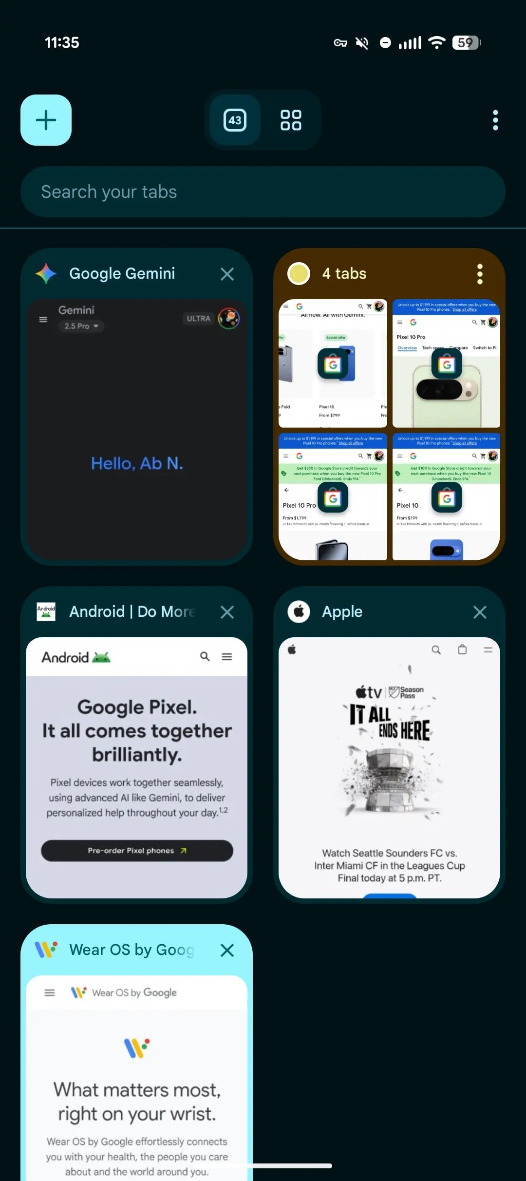
Card management also receives a new look with the grid that now shows the various open tabs and the button to add a new one which is inserted in a square with rounded corners with a dynamically colored background. The sections relating to incognito browsing, switching between tabs and tab groups are also contained in boxes with rounded corners, making the distinction between the different navigation areas clearer. An important role is also played by the colors which contribute to making the user experience more intuitive. Especially the different ones hues in tab groups they adapt to those chosen by the user, facilitating their identification.
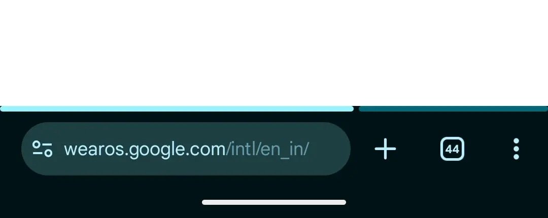
Another new feature, although not yet active for everyone, concerns theOmniboxi.e. the address bar. Some users have noted the introduction of a segmented, soft-cornered loading bar, which shows page loading more intuitively. Although this is a minor change, it represents another step towards an increasingly fluid interface.
Unlike what happened with other Google apps updated to the Material 3 Expressive style, in Chrome the Button sizes have not increased. The team preferred to maintain the compactness of the interface, which has always been one of the browser’s distinctive elements.


